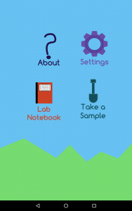
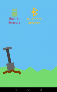
This past week has been busy! I’ve done a ton. One of the things I’ve done is make Field Day look a little prettier. I find it much easier and productive and effective to work on if the application is prettier and nice to look at. Go back to my previous posts and you can see that Field Day was ok looking, but it was really dark and boring. Now it’s quite pretty and fun. I got rid of the circles and just made it icons without a background. I also made it look like the user is in a field, hence ‘Field Day!’ There are probably some other things that I could add, but for now I think it’s pretty and much nicer to work with. You can see pictures of it below.


Leave a Reply
You must be logged in to post a comment.